So, the new Spider-Man: Homecoming movie looks pretty legit, right? The trailers have been a good combination of exciting and funny. The plot seems to be an innovative take on the origin story of our favorite neighborhood arachnid dude. And, who doesn’t want to see Micheal Keaton playing another crazy guy in a flying animal costume?

The answer to that is that everyone wants to see that, hence the mounds and mounds of positive buzz the film has been getting. Tom Holland seems like a great addition to the comic superhero family, and Zendaya coming on the scene for a new take on Mary Jane is pretty exciting.
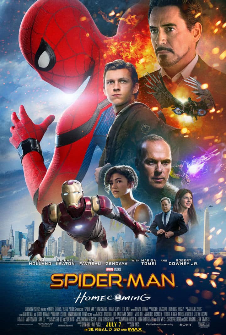
That being said, what sad, tired marketing person okayed this new poster? I would feel bad for them, if not for the fact that this is actually one of the most perfectly terrible movie posters of all time. It has so many bad decisions that it is almost so close to looping back around to genius.
The conversation selling this piece of work must have gone a little something like this:
“You like Tony Stark? Great, here’s two of him!”
“You like Spiderman? Hell yes you do, let’s put two of him on there too!”
“You like The Vulture? Well, actually, I don’t really know…but, too bad, two of him, too! “
“Also, for some reason, the one statue in Washington D.C. that looks like a big ole’ dong. That should have a place of shining glory.”
“Oh, and make Iron Man’s arms look weird and long. No, longer than that. Like, longer than his body. Ok. Good. Perfect.”
“K, and we should still be fair to the other actors in the film, so stick their heads in there somewhere. But only one head each. We don’t want the poster to be too busy.”
You know what, I changed my mind. This is a great movie poster. I can’t wait to see the Spiderclones saving New York City from the evils of orange and purple flashy bits.
It’s a masterpiece.

