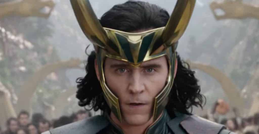
Thor: Ragnarok was a massive success both critically and financially, and hasn’t shown any signs of slowing down, despite being in theaters for almost a month now. While it might be weird to see Loki on the same team as his brother Thor, in this movie, it may be even weirder to take a look at what the character nearly looked like in the movie.
Conceptual Artist Anthony Francisco revealed what Loki could have looked like in the film, and it’s way different than the finished product we ultimately received:
https://www.instagram.com/p/Bb3WShDlpb0/
It’s definitely a much different design than the one we got in the finished film. Things apparently weren’t always great for Ragnarok, as director Taika Waititi revealed that the film failed miserably in early cuts:
“It was very tricky. We spent a lot of time in post-production, actually, figuring that out. It’s a very hard thing to strike that balance throughout two hours and 30 minutes, however many minutes this thing is, for that much time that you’re engaging in a film.”
He added:
“So we failed miserably and had a funny first 10 minutes and then a super-boring rest of the movie. But that’s luckily why you have such a long time in post-production, because you can test all these things out and get the very best film that you can.”
It’s always interesting to know what could have been for certain films, though in this case, it was definitely for the better. This design was definitely interesting, but it’s hard to imagine anything else after watching the film. Who knows? Maybe it could resurface in the Marvel Cinematic Universe at some point.
What do you think of the alternate design for Loki? Did you like Thor: Ragnarok? Be sure to tell us all of your thoughts in the comment section!

